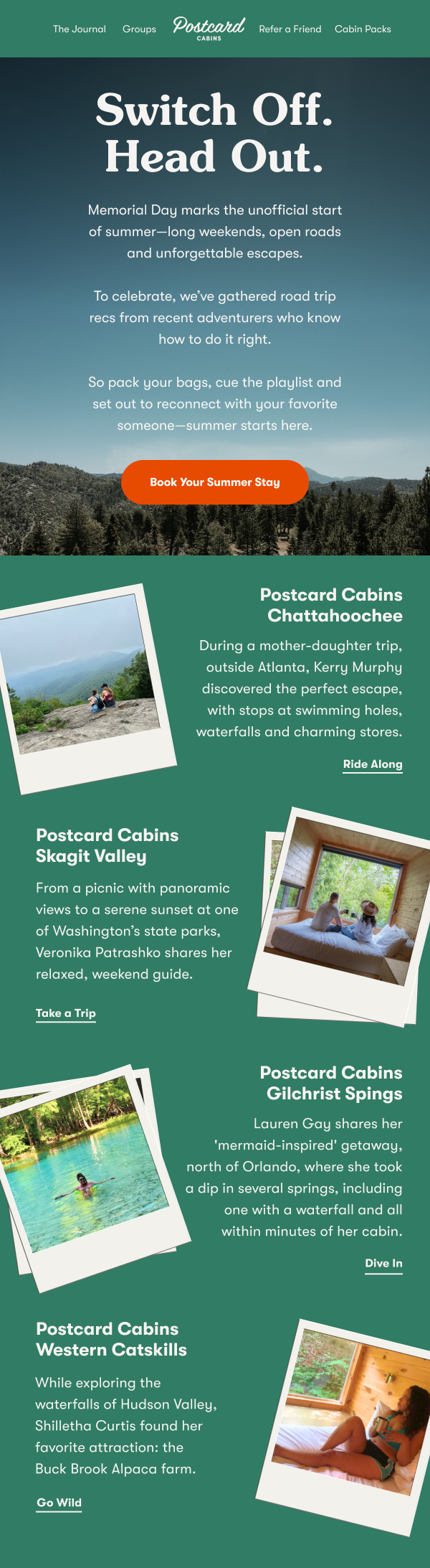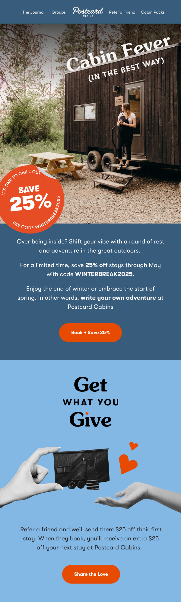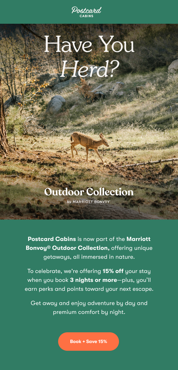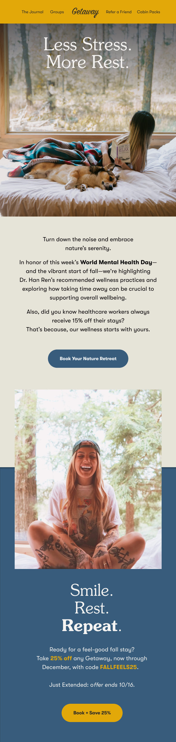

Postcard Cabins
Postcard Cabins - formerly known as Getaway - is a collection of tiny cabin outposts found in some of the most beautiful places in the country. The hospitality brand was also wellness-focused, emphasizing unplugging, connecting with nature, and practicing self care. Prior to its acquisition by Marriott, I was able to guide the company through a name change and brand refresh.
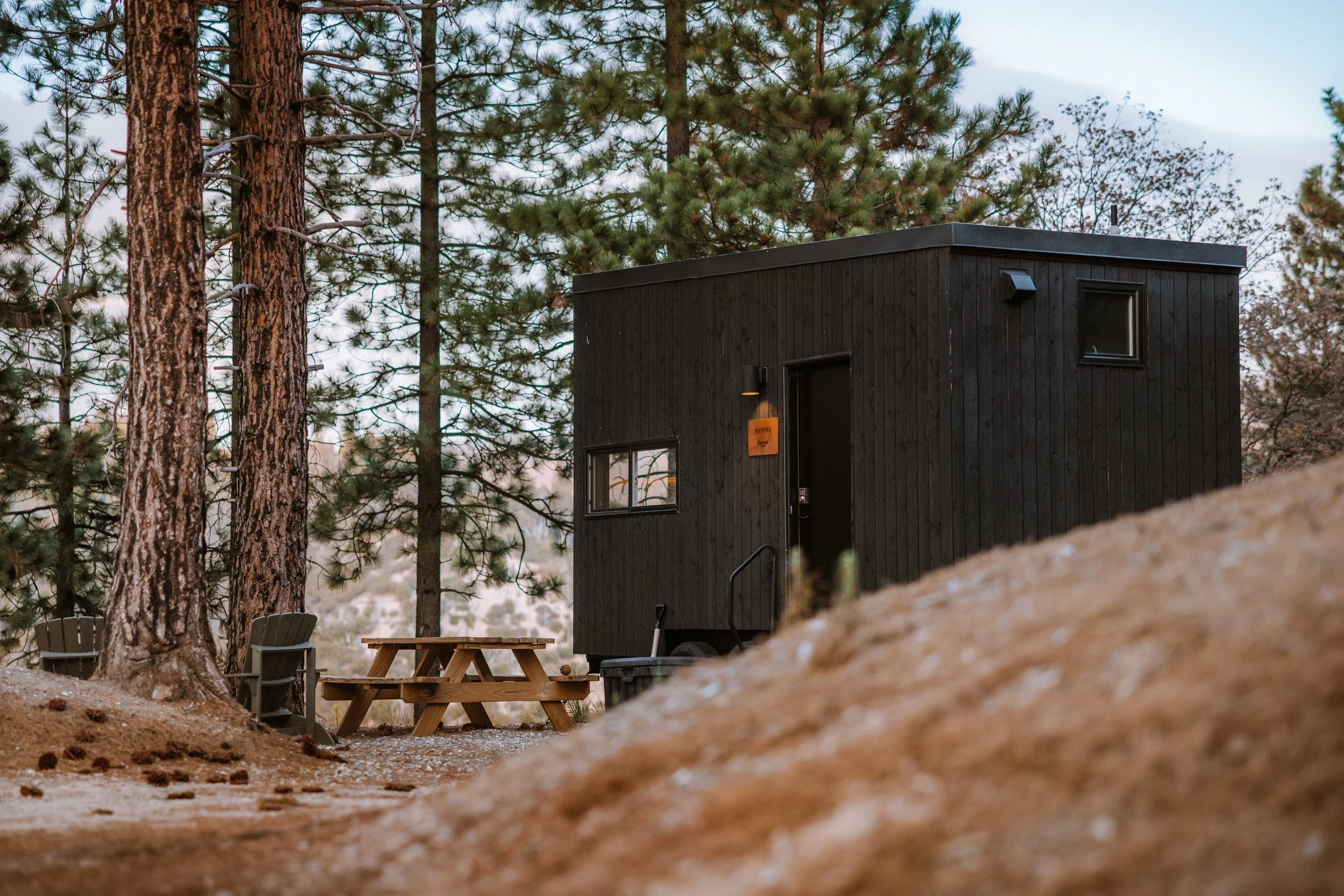
Brand Refresh
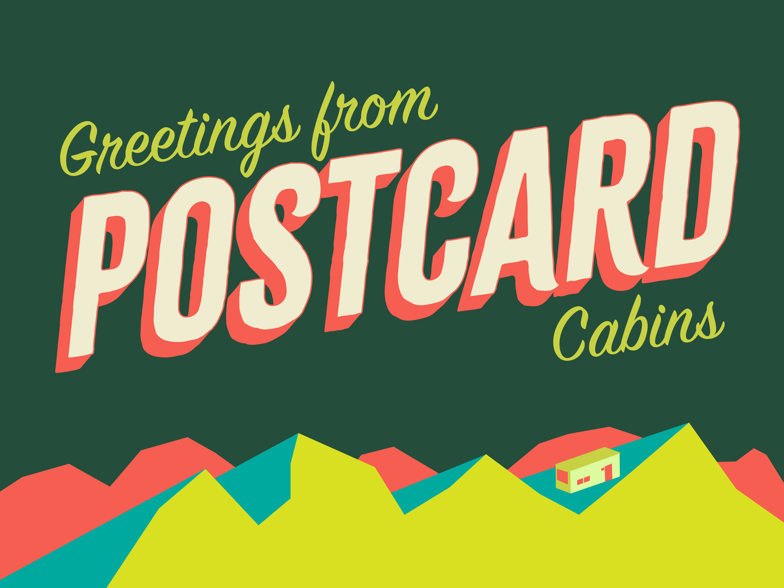
Before we knew about the acquisition, our creative team was handed the task of conceptualizing a brand revamp with a variety of different names. To me, the brand originally felt a little too ‘90s. While unplugging and “going analog” can be nostalgic, I felt we needed a bit more energy and intrigue. I mocked up a few "postcards”, a new color palette, and more.
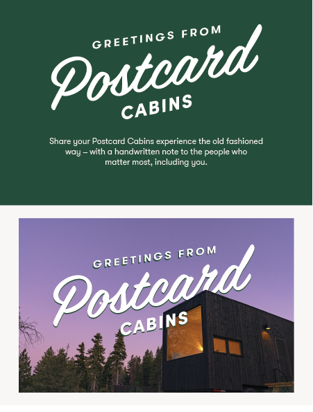
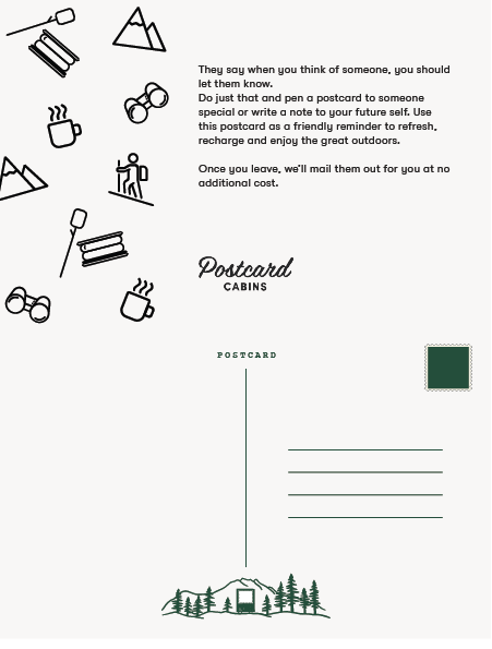
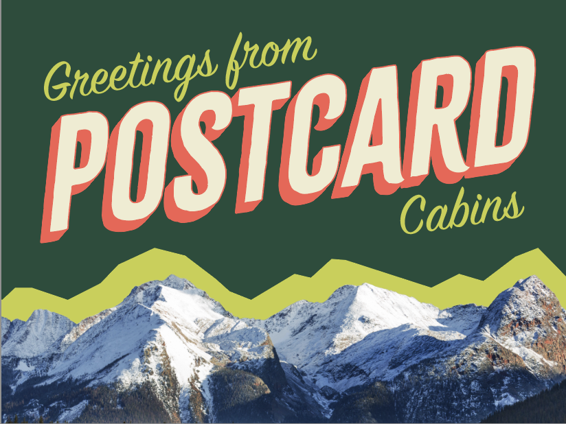
The refresh actually became much simpler with a slightly different color palette, clean line vector illustrations, and a logo utilizing the font Sign Painter.
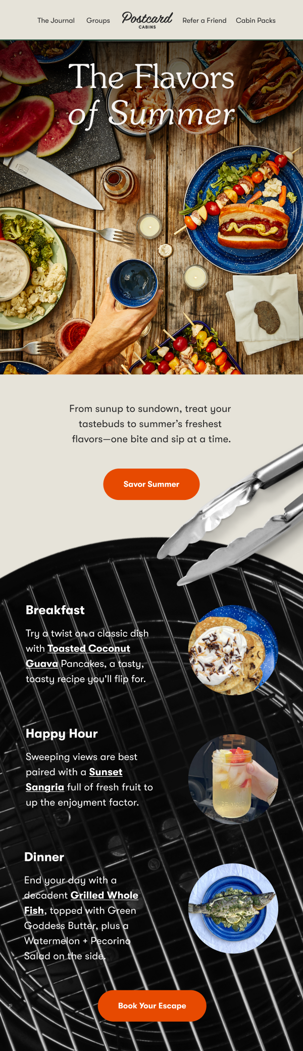
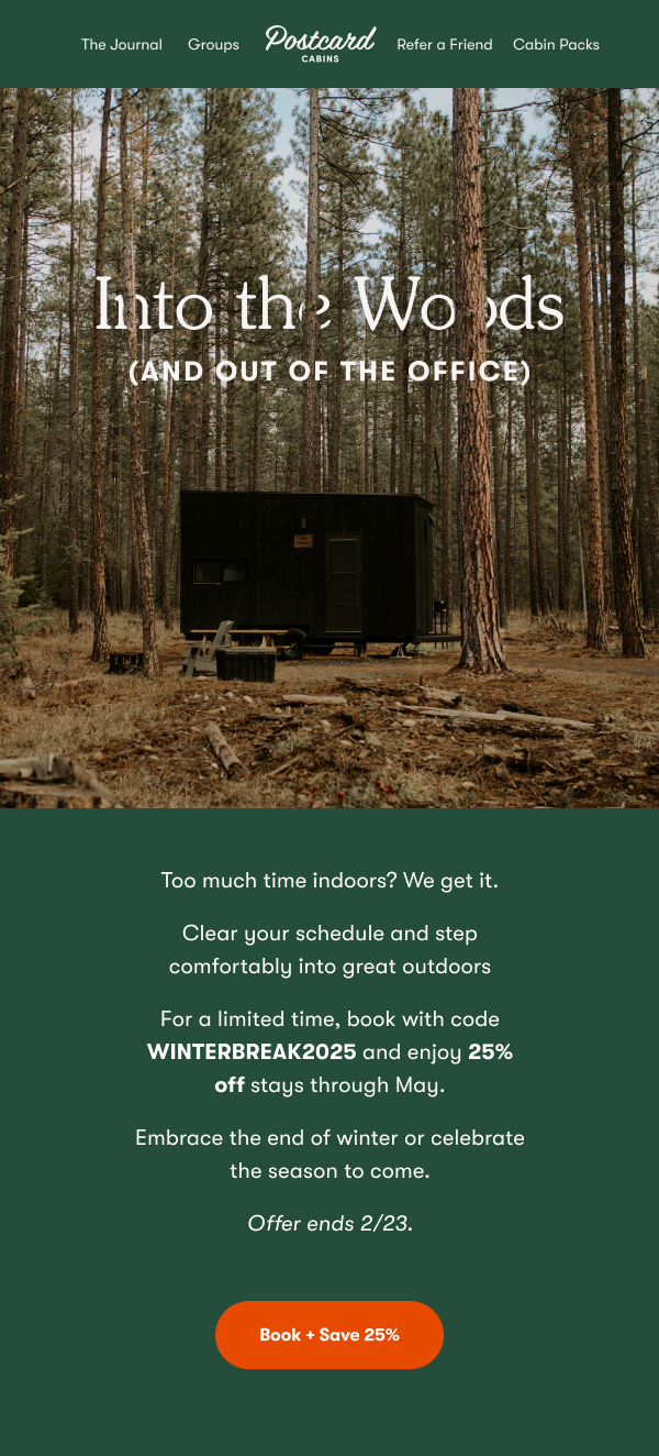
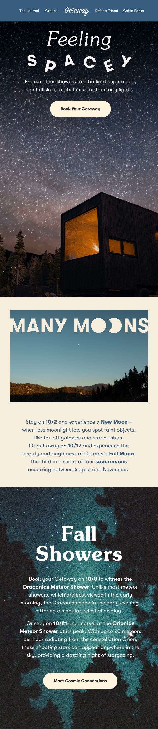
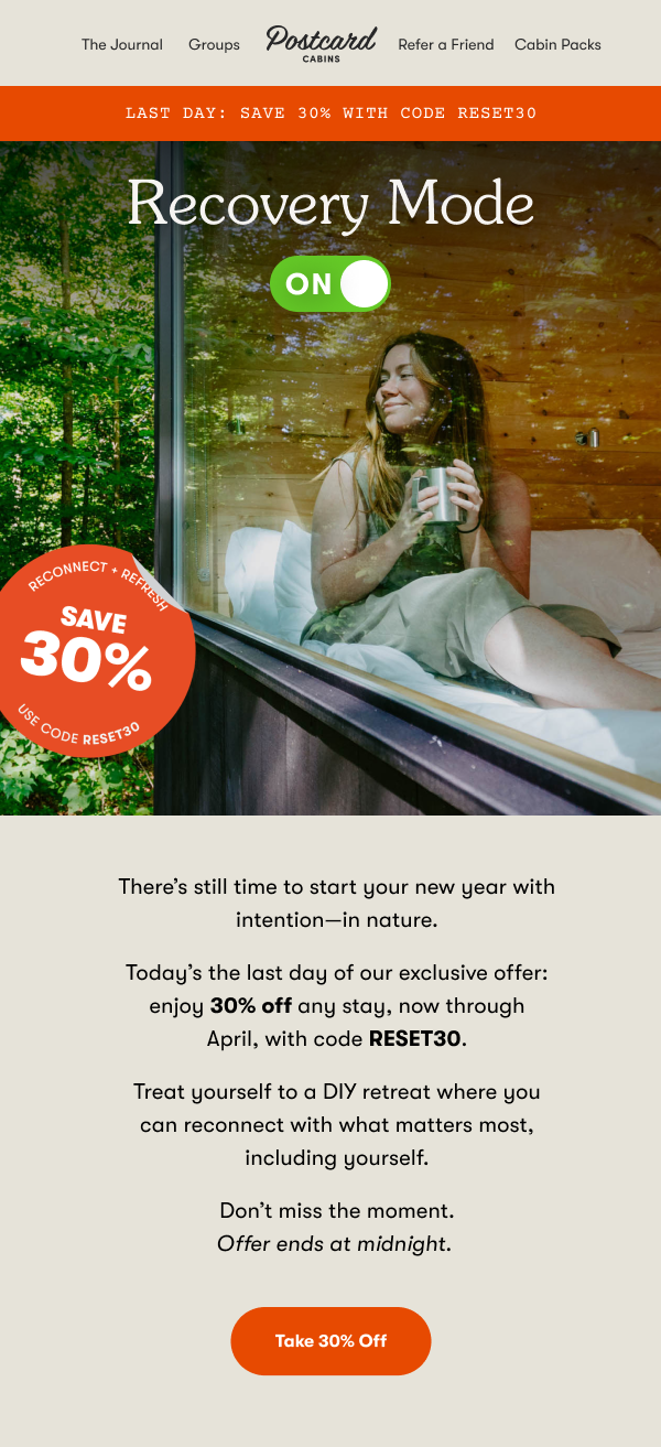
Postcard was a very unique opportunity to get as creative as possible in email (while remaining on brand). The cadence was heavy and the promo calendar was busy, meaning there was a lot to communicate to our audience very frequently. I strove to incorporate surprise and delight where possible. Along with rotating promotions, Postcard had regular, consistent content that amplified its personality while giving the audience a fun, interesting palate cleanser.