
Indy
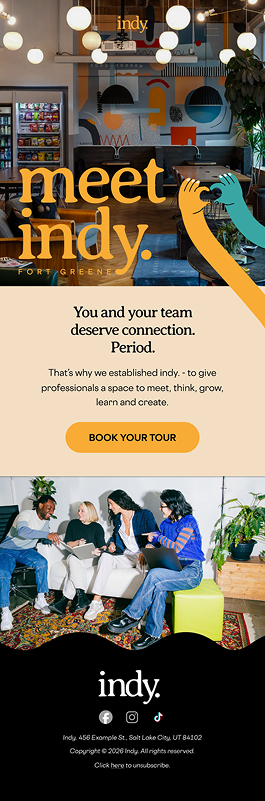
Meet Indy - the “cool little sister” brand to the co-working space Industrious. I worked with a small team as the primary designer to flesh out brand guidelines and design systems to set this vibrant Gen Z brand up for success.
Logo + Color Palette
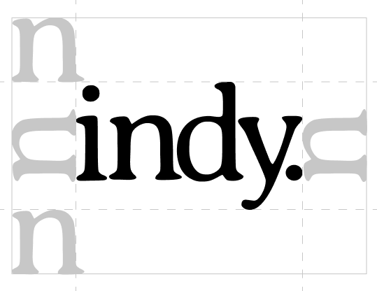
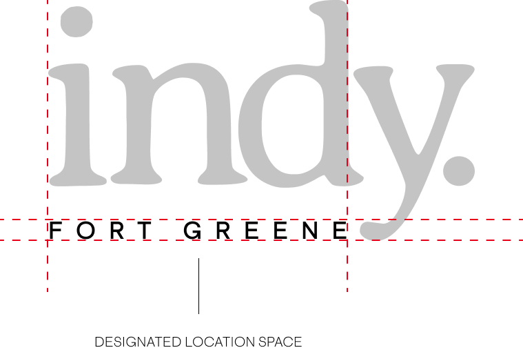
Starting with the logo, I leaned into a familiar-ish classic serifed font that incorporates organic shapes - Averia Serif Libre, complemented with clean, cool Cosmica. We ended up creating two logos for the brand - one generic and one that’s location-specific.
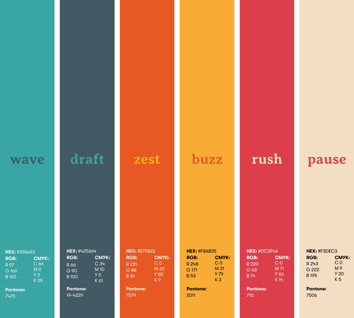
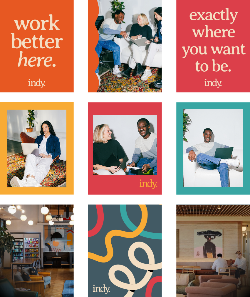
We anchored much of our design in a warm, versatile beige with bright, bold, unexpected accent colors bringing personality and voice.

Photography
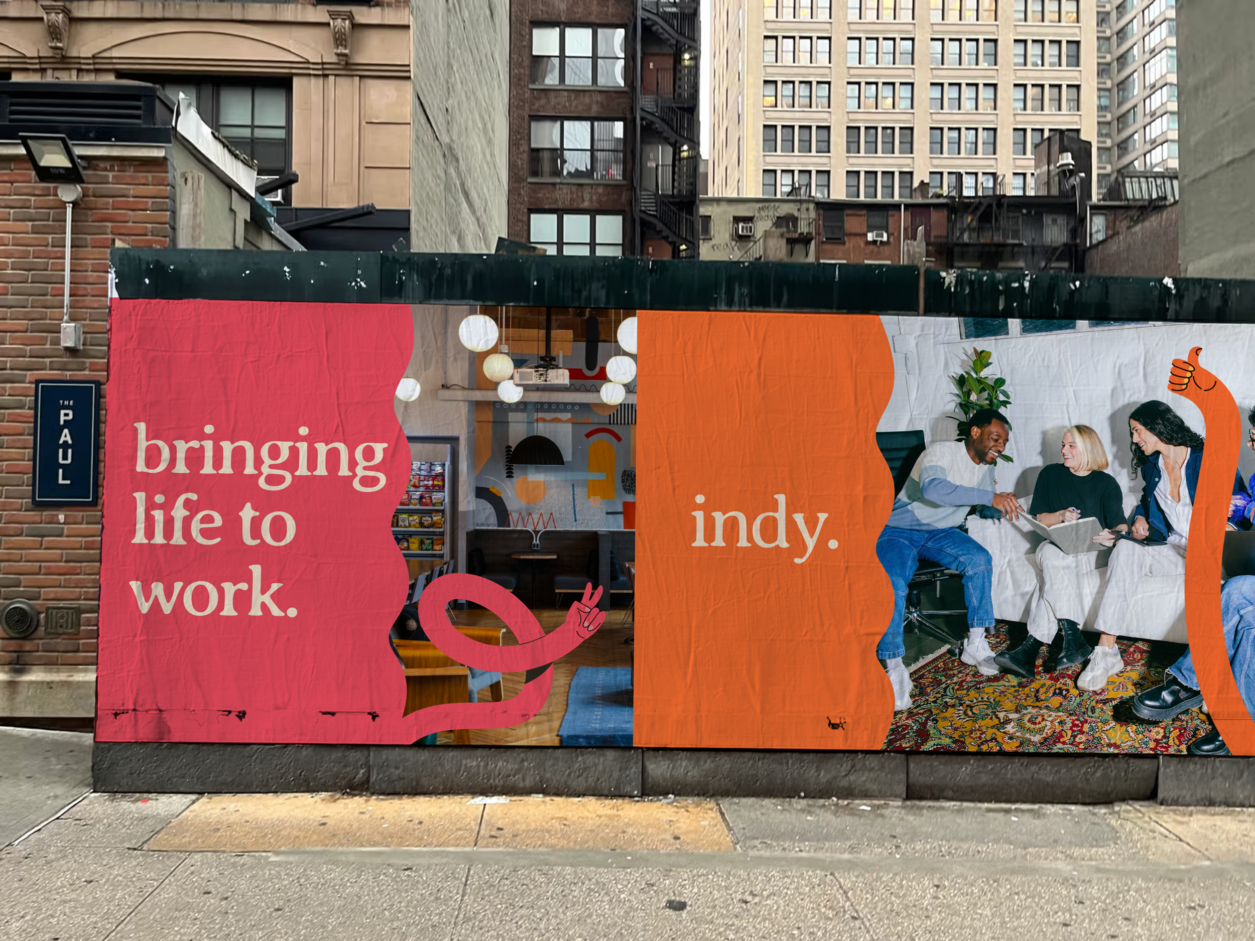
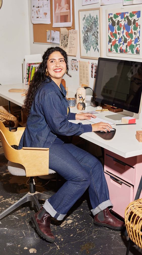
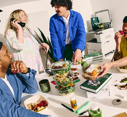
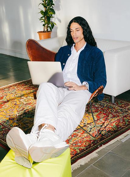
For imagery, I found a phenomenal collection of photos featuring casual young professionals collaborating. Unposed and taken with high flash, these images appeal to millennials and Gen Z in a way that feels natural while still focusing on the whole point - working happier. This photography style will both resonate with Indy’s target audience, but also capture the effervescent spirit of the brand.
Brand Positioning
I also had the opportunity to contribute to verbal brand positioning. The tagline I latched onto was "Work better here" - a simple promise that Indy is made for you as a a human; not just as an employee. After years of working with companies that provide what I call "little luxuries", I have a very clear understanding of demographic mentalities. Gen Z and milliennials want to feel seen and understood as individuals. They appreciate the unusual and gravitate toward brands that speak to them personally. I wanted to communicate (in both visuals and copy) that Indy sees you and wants the best for you.
Brand Graphics
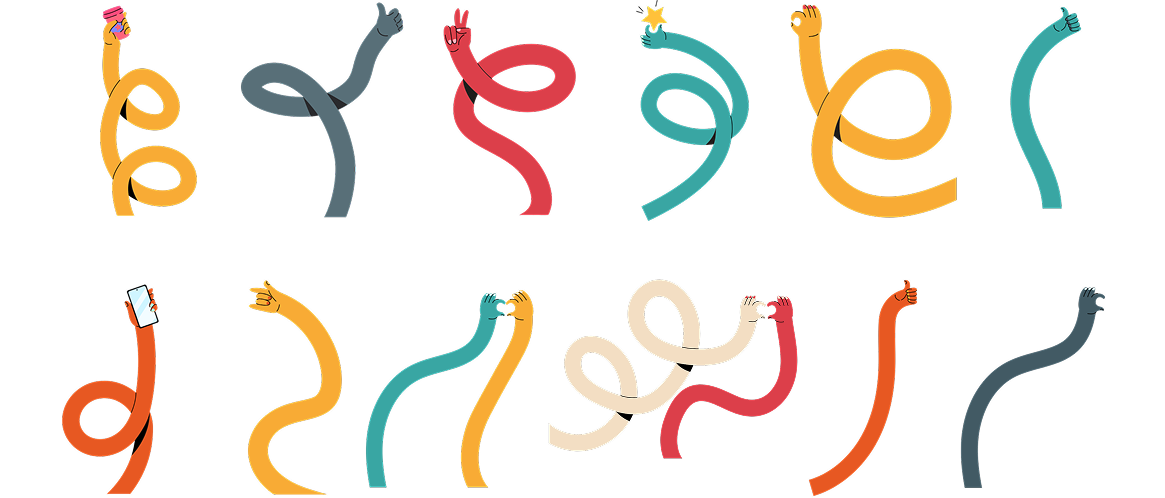
I pitched a collection of wavy hand illustrations to bring camaraderie and creativity to mind. I wanted to bring a sense of imperfect humanity to graphics with these while also mimicking the wavy/swirly elements in other graphic touchpoints. Visual cohesion + personality = winner!