

Brand Development
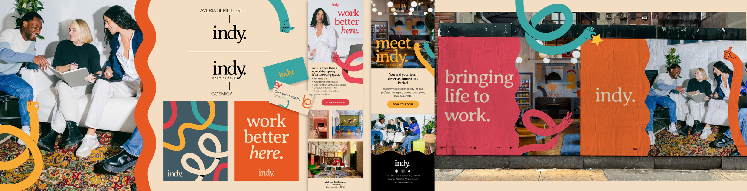
Meet Indy - Industrious' cool little sister. Starting with the logo, I leaned into a familiar-ish classic serifed font that incorporates organic shapes - Averia Serif Libre, complemented with clean, cool Cosmica. We anchored much of our design in a warm, versatile beige with bright, bold, unexpected accent colors bringing personality and voice. For imagery, I found a phenomenal collection of photos featuring casual young professionals collaborating. Unposed and taken with high flash, these images appeal to millennials and Gen Z in a way that feels natural while still focusing on the whole point - working happier. I also had the opportunity to contribute to verbal brand positioning. The tagline I latched onto was "Work better here" - a simple promise that Indy is made for you as a a human; not just as an employee. After years of working with companies that provide what I call "little luxuries", I have a very clear understanding of demographic mentalities. Gen Z and milliennials want to feel seen and understood as individuals. They appreciate the unusual and gravitate toward brands that speak to them personally. I wanted to communicate (in both visuals and copy) that Indy sees you and wants the best for you. I pitched a collection of wavy hand illustrations to bring camaraderie and creativity to mind. I wanted to bring a sense of imperfect humanity to graphics with these while also mimicking the wavy/swirly elements in other graphic touchpoints. Visual cohesion + personality = winner!

Located in Miami Beach, Airmail was Sourced Craft Cocktails' first brick and mortar concept. I was granted the opportunity to build its branding from the ground up. I worked with my team to build a moody, tropical cocktail lounge with a hint of Cuban nostalgia (in a food hall, of all places!). From its mission statement to its physical aesthetics to its rotating menu, I was able to contribute and develop my passion for high level branding with Airmail.

While working with Kashmere Kollections (a branch of 310 Nutrition), I had the opportunity to present a new, crisp brand refresh using this mood board. I incorporated a similar color palette to their original for a gentler transition. I also added more youthful, vibrant imagery, cut out animation and faux iPhone notifications, Google search bars, etc. to attract a younger audience.

As part of my application for Senior Brand Designer with Postcard Cabins (formerly Getaway), I took it upon myself to put together a conceptual brand refresh deck that outlined my vision for how to develop brand personality and revitalize an already large fanbase. To skew toward a greater Gen Z audience, I pitched Polaroid, vintage-style high flash photography, '90s reminiscent merch and emphasis on unplugging from the digital zeitgeist (one of PC's main tenants).

This mood board is totally conceptual. When reviewing Eberjey's current branding, I felt that, especially for a pajama brand, imagery and overall look + feel were lacking comfortability and a sense of attainability. I found myself wishing the brand were more organic. With the understanding that the product is luxurious, high quality and intentionally "buttoned up", I created a branding strategy that incorporated more relaxed photography, greater diversity in models and colors/elements that conveyed warmth.